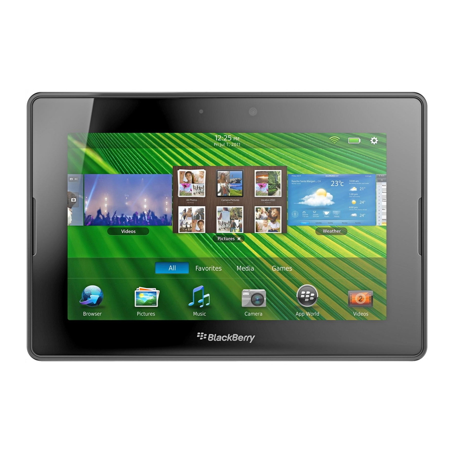
Blackberry PlayBook Tablet Ui 매뉴얼 - 페이지 23
{카테고리_이름} Blackberry PlayBook Tablet에 대한 Ui 매뉴얼을 온라인으로 검색하거나 PDF를 다운로드하세요. Blackberry PlayBook Tablet 39 페이지. Tablet
Blackberry PlayBook Tablet에 대해서도 마찬가지입니다: 사양 (21 페이지), 사양 (21 페이지), 사용자 설명서 (48 페이지), 안전 및 제품 정보 (19 페이지), 보안 기술 개요 (46 페이지), 사용자 설명서 (42 페이지), 빠른 시작 매뉴얼 (2 페이지), 사용자 설명서 (34 페이지)

UI Guidelines
•
Verify that the content for radio buttons remains static. Content for radio buttons should not change depending on the
context.
•
Do not start an action as soon as users select a radio button. For example, do not open a new screen when users select
a radio button.
•
Group and order radio buttons logically. For example, group related options together or include the most common
options first.
•
Avoid ordering radio buttons alphabetically. Alphabetical order is language-specific.
•
Use clear, concise labels. Verify that the label clearly describes what occurs when users select the radio button.
•
Place labels on the right side of radio buttons.
•
Use sentence case capitalization for the individual radio buttons in a group. Capitalize the first word and any other word
that requires capitalization (such as a proper noun).
•
Do not use end punctuation.
Segmented controls
A segmented control is a series of connected radio buttons. You can use segmented controls to allow users to filter or
change the content that is displayed on the screen. Users tap a segmented control to see a list of values. Users can tap a
value to select it.
Best practices
•
Group and order controls logically. For example, group related options together or include the most common options
first.
•
Avoid ordering controls alphabetically. Alphabetical order is language-specific.
•
Use clear, concise labels.
•
Use sentence case capitalization for the individual controls in a group. Capitalize the first word and any other word that
requires capitalization (such as a proper noun).
•
Do not use end punctuation.
Toggle switches
You can use toggle switches for most binary options. For example, you can use a toggle switch for an option that can be
turned on and off. Users can tap the alternate option or drag the slider to the left or right to change the state of the switch.
UI components
23
