UI Guidelines
Application icons
Designing an icon for your application gives you the opportunity to showcase your application to BlackBerry PlayBook
tablet users. In the BlackBerry App World storefront, an icon is the first introduction that users have to your application.
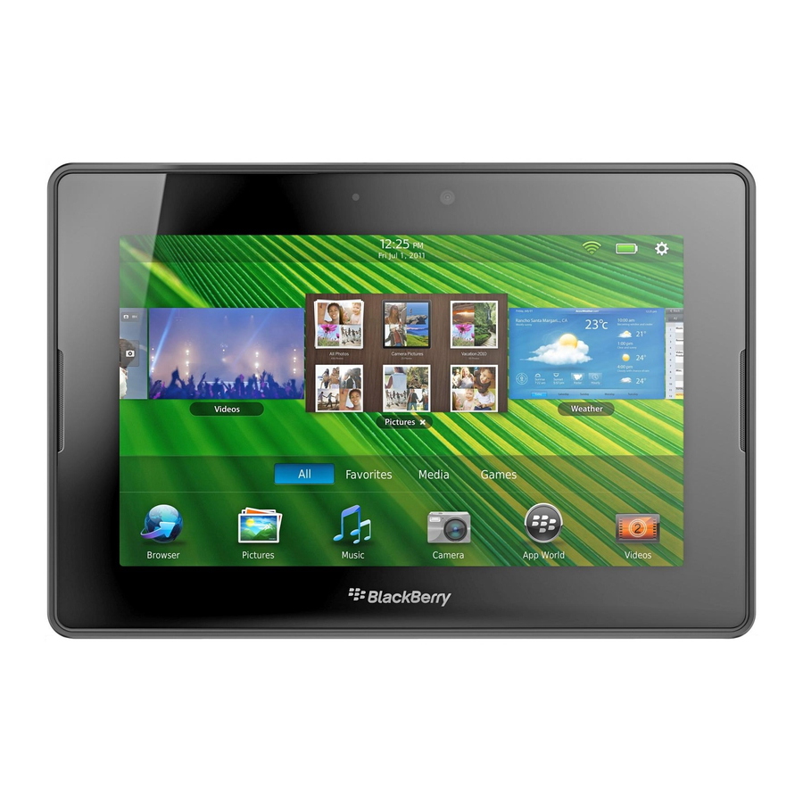
The icon also appears on the home screen as the way for users to open your application.
It's important that your icon is visually interesting. At the same time, it's also important that the icon maintains consistency
with the design of existing BlackBerry application icons. You want the icon to fit in the application list and not be either too
bland or too conspicuous.
Best practices
•
Make sure that the icon has the following properties:
•
Size: 86 x 86 pixels. If the icon is smaller than 86 x 86 pixels, it could appear out of place next to other icons. Any
icon larger than 90 x 90 pixels will not be displayed on the screen.
•
Resolution: 72 pixels per inch (PPI)
•
Mode: RGB color
•
Type: PNG
•
Keep the main graphical elements of the icon within a 77 x 77 pixel area, which allows for a buffer zone. If the main
graphical elements occupy the entire 86 x 86 pixel area, the icon will look too large in the application list. You can
accessorize outside of the 77 x 77 pixel area, but the main graphical elements should stay within this area.
•
Position the icon image 2 pixels from the bottom of the 86 x 86 pixel area. The position aligns the baseline with the
other icons in the application list, and the base shadow, which is automatically created, will look correct.
•
Make sure the perspective of the icon is one point viewed head on (no rotation). The perspective is the angle that the
icon is viewed from.
•
Use rounded rectangles with a corner radius of 20 pixels.
•
Apply lighting that is top-down and strikes the middle of the icon. This effect also makes the icon look correct over the
base shadow.
32
Application icons

